SobrietyPal
Sobriety and habits tracking app
My Role
UX Research | UX Designer | UI Designer
Method
Competitive Research | User Flow | Wireframes | Prototyping | User Testing | Visual design
Tools
Figma | Adobe Photoshop | Pen and Paper

About
Sobrietypal is a platform that aims to support individuals who are seeking to change their habits and lifestyle. It offers different features that help the user track their progress and stay motivated.
Problem
How can an individual seeking to track their sobriety or change habits effectively manage triggers and receive support during their healing process?
Solution
The app helps users stay sober, develop coping strategies, and build a support network, emphasizing milestones and community engagement.
Competitive research
I performed competitive analysis on leading apps in the market, including 'I Am Sober,' 'Sober Time,' and 'Sobriety Wagon,' to identify key features essential for a sobriety app. This research helped me understand how I can enhance the user experience.
Tracking
The tracker celebrates and visualizes users' sobriety milestones, motivating their ongoing recovery journey.
Trackers foster accountability and self-reflection, helping users understand patterns and empower their commitment to sobriety.
Badges
Badges visually acknowledge sobriety milestones, providing users with a sense of accomplishment and ongoing motivation.
Badges foster a sense of community, enabling users to share and celebrate achievements with others, enhancing the overall support network within the app.
Savings
The money savings feature provides a visual boost by showcasing the direct financial benefits of sobriety, offering users motivation and positive reinforcement in their recovery.
Community & Motivation
The community feature fosters mutual support and togetherness, inspiring users with posts that reinforce the belief in successful recovery and motivate overcoming challenges.

User story / User flow
After conducting a competitive analysis, I identified the key features of a sobriety app and the expected UI patterns users anticipate. Subsequently, I created three scenarios illustrating how users will interact with the app.
“When I'm opening the app for the first time, I want to create a customized profile to personalize my journey.”
“When I'm using the app, I want to engage with the community and share posts, fostering support and motivation in my sobriety journey.”
“When I'm using the app, I want to track my time and money savings, gaining a clear overview of my progress.”

Wireframes
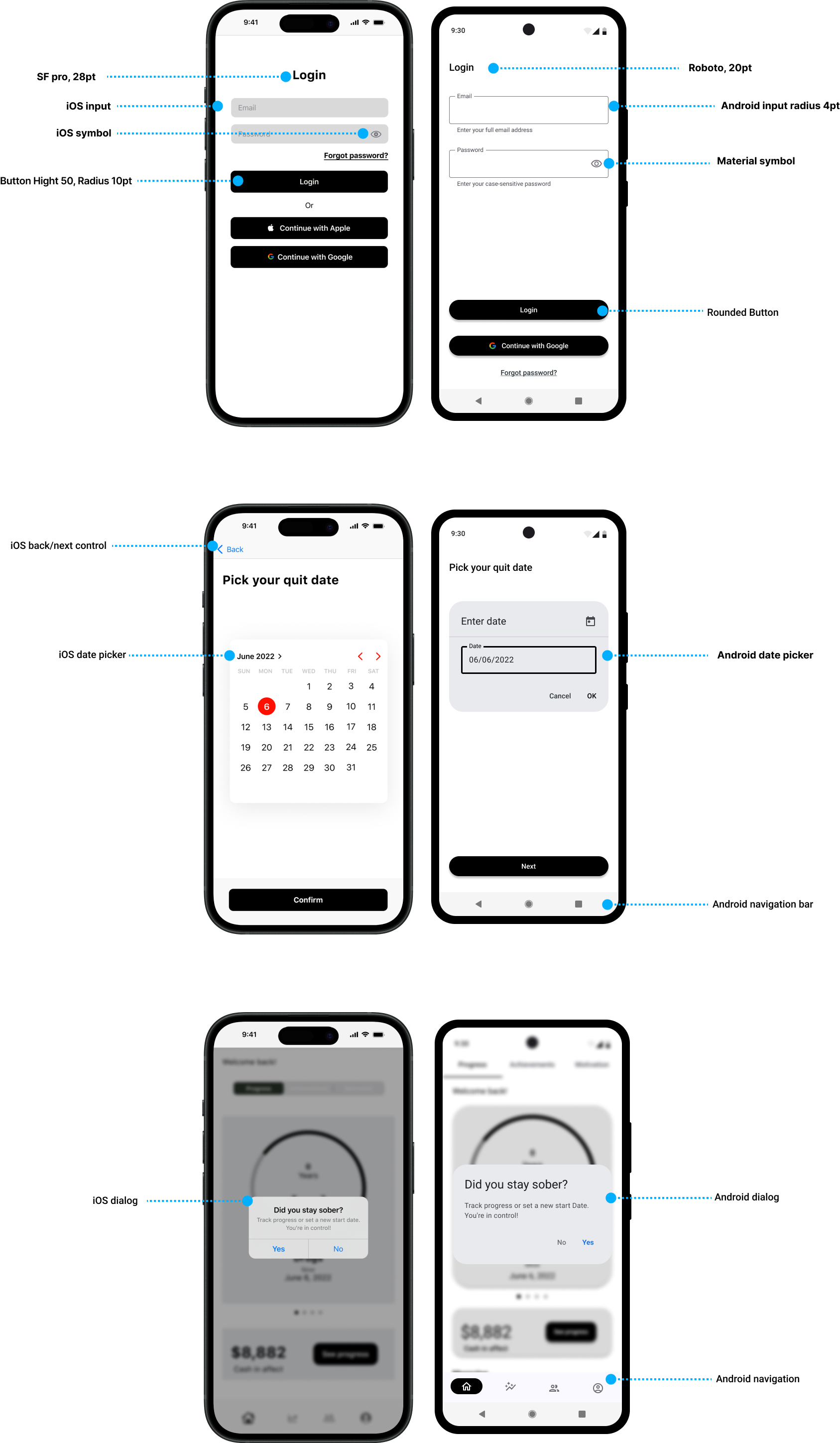
The app has been designed taking count of the difference between native iOS and Android Navigation and features. Components and Typography have been implemented according to iOS and Material Design guidelines.
Native navigation

User Testing & Redesign
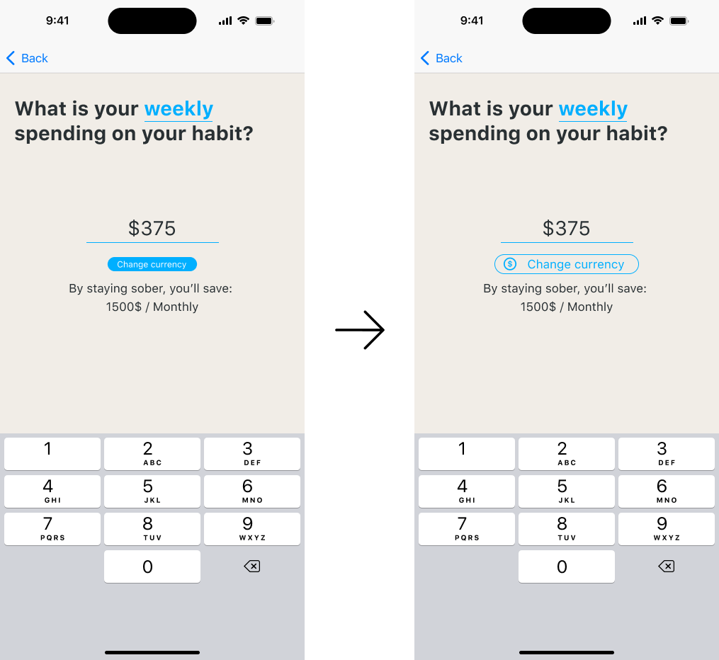
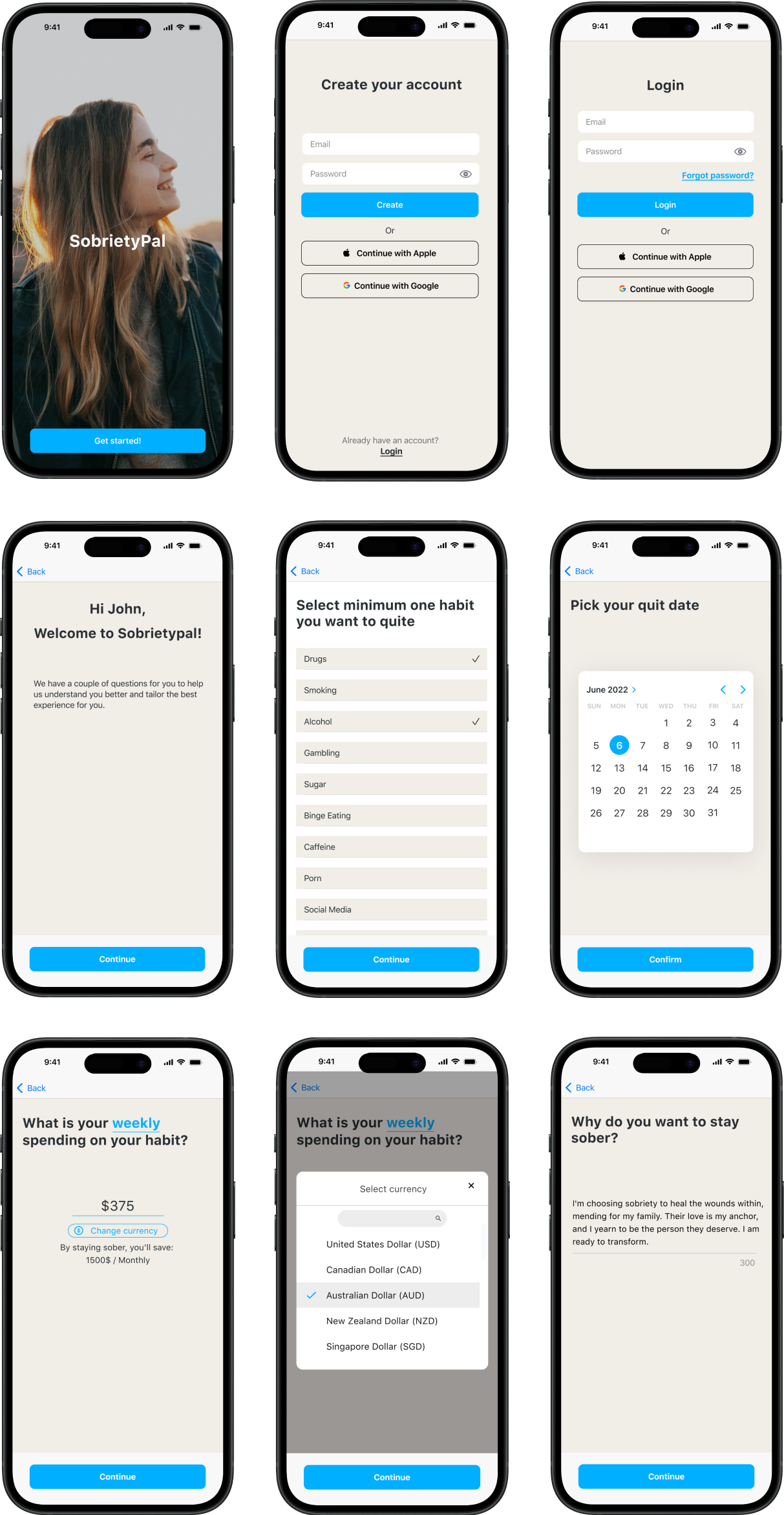
“The button on the "Spending" screen is too small. Considering adding a currency icon would be beneficial. I appreciate being able to see how much money I am about to save and having the ability to switch between weekly and monthly spending.”
Nina
“I'm missing a short, inviting call to action asking why I want to change my lifestyle.”
Linn
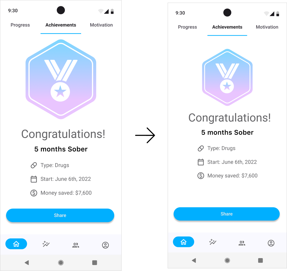
“The badge appears a bit too large for the achievement screen. However, I love the gradient.”
Karen
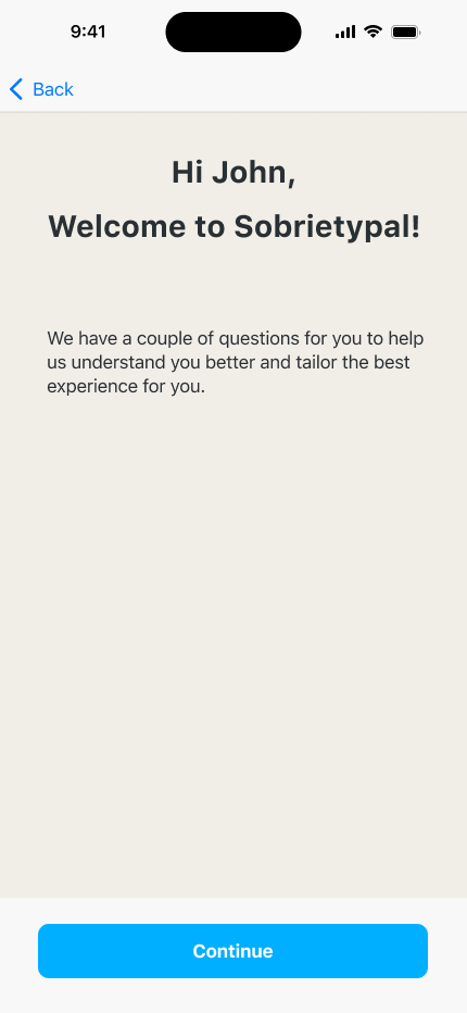
“Consider adding a screen that informs the user they are about to begin the app onboarding process.”
Dave
*The currency button has been redesigned.
*A new short CTA accompanies the text field.
*Badge has been resized to fit the screen.
*New screen

Style Guide
The sobriety app features a calming palette of blue, purple, and off-white. This creates a friendly and serene atmosphere, promoting readability and avoiding potential triggers. The universal appeal of these colors fosters trust and wisdom for users seeking support on their sobriety journey.
Final Design
Onboarding
Tracking
Create & Connect

Haptic Feedback & Notifications
In crafting the user journey for a sobriety app, two pivotal aspects come to light. Firstly, the gamification element, with badges serving as visual rewards, enhances the overall user experience. Secondly, a dedicated focus on privacy ensures users feel supported in their sobriety. I've integrated friendly check-in notifications, akin to a supportive friend, and discreet celebrations for achievements. The gamification of badges involves subtle vibrations to avoid attention, yet a share button is included for users to celebrate their achievements within the sobriety community and potentially beyond.
Failed login
Wrong Email address or wrong password
will be indicated in a strong short vibration to catch the user’s attention.
Badges
When users earn a badge, the system gives a subtle, silent haptic feedback—a light vibration. This approach aligns with privacy guidelines for UI in diverse environments, and public transportation, where avoiding attention is crucial.
Notification
When users log into the app, they cannot reach the dashboard without responding to a discreet, silent vibration alert prompting them to check in for sobriety, ensuring privacy.
Reflection
Creating a sobriety app was a challenging yet intriguing journey. The most demanding part involved delving into Native apps and navigating the intricacies of Material and iOS guidelines. What I found most fulfilling was crafting something positive to support individuals on their path
to sobriety. I gained valuable insights into design and psychology, implementing elements like gamification in a positive manner. Prioritizing privacy and fostering a supportive community emerged as crucial for users' healing.
Looking ahead, there's room for improvement, with potential enhancements like incorporating support groups and facilitating meetings with counselors to further elevate the app's impact.


